
(Or, perhaps more accurately, a Windows trick which was new to me. Apologies if you know this one.)
Can you tell the difference between the following two snapshots?

If the two images look the same, then this trick is not for you. You might want to update the prescription of your spectacles. :)
The top image is "default Firefox", which is fairly pixelated (especially italic text), while the bottom image uses the Windows "ClearType" fonts, and is very smooth to read.
I previously thought the pleasantly smooth fonts were a feature of Microsoft's Internet Explorer (which seems to be quite a popular assumption). Happily, you can get Firefox to do the same by simply going to "Display Properties" (right-click on the Windows desktop and select "Properties") -> "Appearance" tab -> "Effects" button -> select "ClearType" from the drop-down list of screen fonts. Done!
Reading blogs is much easier this way, it seems...
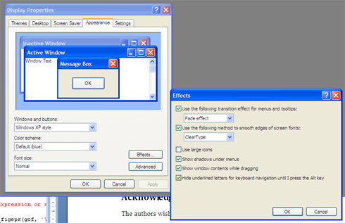
Can you tell the difference between the following two snapshots?
If the two images look the same, then this trick is not for you. You might want to update the prescription of your spectacles. :)
The top image is "default Firefox", which is fairly pixelated (especially italic text), while the bottom image uses the Windows "ClearType" fonts, and is very smooth to read.
I previously thought the pleasantly smooth fonts were a feature of Microsoft's Internet Explorer (which seems to be quite a popular assumption). Happily, you can get Firefox to do the same by simply going to "Display Properties" (right-click on the Windows desktop and select "Properties") -> "Appearance" tab -> "Effects" button -> select "ClearType" from the drop-down list of screen fonts. Done!
Reading blogs is much easier this way, it seems...
2 comments:
I actually like the non-anti-aliased text, er, aliased text better than the smoothed anti-aliased text. I find it easier to read when it's crisp.
My wife feels exactly the same; in some packages, notably her note-taking software, the "smooth" fonts appear slightly blurred. A pity!
Toodlepip,
Hobbes
Post a Comment